
HR NEXUS
Task Rabbit for HR Pros
Objective
HR Nexus is a service that connects freelance HR pros with established clients and has project management capabilities for both sets of users. The purpose is to create an MVP and test it.
This service would be comparable to the Task Rabbit of HR hiring since there is a quick turnaround. Over nine weeks, my mission was to define the design requirements, create system architecture, user journey maps, user flow, wireframes, and an interactive prototype that I had to test. The only materials given were the research and a few user personas.
Methods: Design Challenge, Design Requirements, Precedent Gathering, User Flow Diagram, User Journey Map, Site Map, Wireframing, Interactive Prototype, and Remote User Testing.
Tools: Figma, LucidChart, Miro, Useberry.
“How can we connect young entrepreneurs to human resource consultants for short-term HR solutions by experts looking to work as part-time consultants?.”
— Problem Statement
Requirements
There was a two-month deadline to complete this phase of the project.
Some desktop-style functionality was required to be functional within a mobile version of the app
Short-term service, so the onboarding process has to have a quick turnaround for us it was 48 hours.
The Service must be a one-stop-shop for both hiring clients and professional hires.
Different sets of project management features were needed between the clients and pros.
Design
Once the design requirements were defined, I could hone in on what the user flow would need.
In the beginning, it was clear that creating a desktop version first was important as the app would not necessarily support features such as chat and file uploading as easily. Despite knowing that there can always be another iteration, I created a mobile version in my prototype that showed my user journey map.
From my User Journey Map I created a User Flow Chart, then a wireframe, then a prototype, iterated again, and had a second prototype that I user-tested.

User Journey Map divided into four main User flows

User Flow Chart for Searching
Prototype
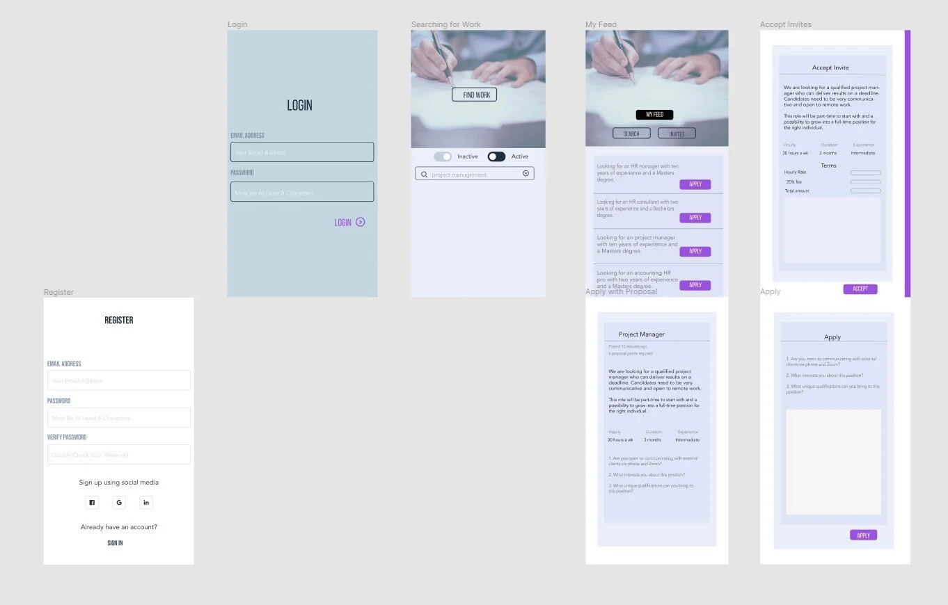
The first iteration of my prototype included a login page, but this confused many of the users I presented it to, so I removed it in the second iteration. The second iteration included an upgraded branded look that is consistent with similar services.

First Iteration with Register/Login Page

Second Iteration with Login/Register removed, tasks assigned
User Testing
First Iteration
Going through the steps on my prototype for the HR Nexus App, first iteration
Second Iteration
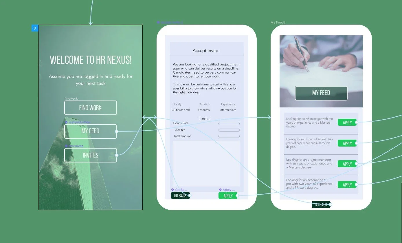
Here is a user who understood the test perfectly and went through the prompts quickly.
Final Thoughts
After a few more iterations of my previous HR Nexus prototype, I came up with a new prototype to test. During the user test, the users were expected to complete three tasks, followed by three questions. I had 20 user sessions screen captured, with a completion rate of 55% and a drop-off rate of 45%. The average run time of the entire test was 1 minute and 11.5 seconds. The participants’ ages ranged from 23 to 66. Half of the sessions were on mobile, the other half were desktop, and Chrome was the most used browser.
Key takeaways
This particular test had issues on mobile, which was not something I could control. The user either knew how to switch to desktop mode, figured out how to navigate on mobile, or dropped off. The mobile display issue may have caused the confusion, and even when I tried it on my phone, I had problems but immediately switched to desktop mode to remedy that, but not every user would know to do that.
My first iteration confused many users with the login and registration page, so I abandoned it and let the user know that they should assume they have already logged in at the beginning of the user test. I learned that users do not read, and most clicked the wrong APPLY button, but it didn't affect the outcome because it was part of another test.
Insights
The user was confused about where they had to go but could complete the test. Consider faster ways to complete the task. They said a few of the back arrows were broken, but I tested all of them, and they worked, consider changing the back arrows’ position to be more prominent.
It was rated 4 out of 5 on the difficulty by the user.
A younger user took long pauses, and their test time was over 6 minutes; this tells me they might have been distracted while taking the test.
The user took a while to respond to the second question but said it was easy to navigate and through the test.
Several users clicked on the wrong Apply button but seemed to read the prompt, so maybe that was confusing? Or are people just more likely to always click the first option? One user requested the ability to login (which I had in my previous iteration but took out because most people who looked at it were confused by it and thought they had to log in to view my prototype).
Next Iteration
In the next iteration, the user interface and test should include
Aligned buttons on the Project Manager page
Microcopy on the Accept Invites page without hyphens in it.
Make the buttons on the Apply page equidistant apart.
Remove the option to skip a task in the user test.
Enlarge the area around the back button so that it was easier to click
Bold or change the text's color on the Landing Page to force the user to read it
Create an option for dark mode interface
Figure out faster ways to complete the tasks
The comment was to consider moving back buttons on the top or Xs instead of the back buttons. I did notice in one of the tests it did cut the back button off.
Either increase the font size for accessibility or change the text to make it more obvious which job is which, different colors for different results, alternate a few shades.
Regarding usability options, an older user said it was hard to read; someone else suggested a dark mode be made available.
Conclusion
In conclusion, while this was a straightforward test, it was not easy to complete on mobile, and considering that more than half of the test takers used their phone, it is clear that a mobile-first approach should be the focus for the next iteration. Considering different factors such as navigation, ease of use, and clarity will guide the user through the test and will ensure a higher completion rate for the next test.